
Watercolour
15" x 22"
For information on this or any other painting contact me at this link.


 The view just a few metres away from Orihel's cabin. This painting was done as a live demo. I was inspired by a technique that I picked up at Stephen Quiller's workshop. The 5 green trees in the front row were completely lifted out from the painted background. I'm always impressed by how clean the colour can be even though the background was originally a dark wash. It's necessary to lift out while the background paint is still very wet. Quite a sloppy technique but I like the feel especially the reflections in the water.
 This is a painting from my Lake of the Woods Series. We spend a couple of weeks a year at our cabin there. This plein air painting was done on the first day after all the crowds of people had left. It was painted from the Orihel's dock and half way through the rain came which had quite an effect on the painting.
 From our recent trip down Highway 22. I loved the way the road recedes into the mountains.

 On a recent painting trip in Banff National Park, we spent a morning along the Bow Valley Parkway. We stopped for a picnic lunch and this was the scene I kept staring at as we ate.

 This is my first attempt at using oil paint. Originally this was a watercolour but as often happens it needed some adjustments and I decided to modify it with oil. As much as I love watercolour I appreciate the ability to add lights over the darks with an opaque medium. I'd always been interested in oil but was turned off by odour issues. For this work I used walnut oil and found that there weren't any odours in my studio. I guess that by eliminating the turpentine or paint thinners it is possible to enjoy a good work environment. I had tried some odourless thinner before but it was far from odourless. Anyway, the way that oil paint can be pushed around was neat and if it is possible to keep fresh air in the studio I'll certainly try it again.
 I was intrigued by this scene on the Bow Valley Parkway during a recent painting trip to the Banff/Kananaskis area. I must admit I had in mind some of the Group of Seven's paintings of burnt out areas.
  A particularly attractive composition. Very interesting to try a different type of portrait.


 This image of actress Helen Menken was done for my drawing class. Because the students in the class are progressing so quickly we now take accuracy for granted and are working on expressing the feeling of the portrait. This particular image speaks to me of quiet contemplation. I'm also experimenting more with a cross hatching approach rather than my normal method of smudging the graphite for shading. I started trying this in order to speed up the process and am finding now that I really enjoy the more direct nature of cross hatching.
 The same bold colour approach applied to a scene we came upon while hiking along the Elbow River.
 This image was a true pleasure to do. I wanted to try drawing on a toned background and letting the toned background be the mid values so I only needed to add the dark values and then the white highlights. It was done on a pastel paper with a pronounced circular texture. The entire drawing tool only about 45 minutes 30 of which were for the drawing. The shading was fast and easy and when I added the white charcoal it just came to life. I was literally blown away by this process and will definitely be trying this again.
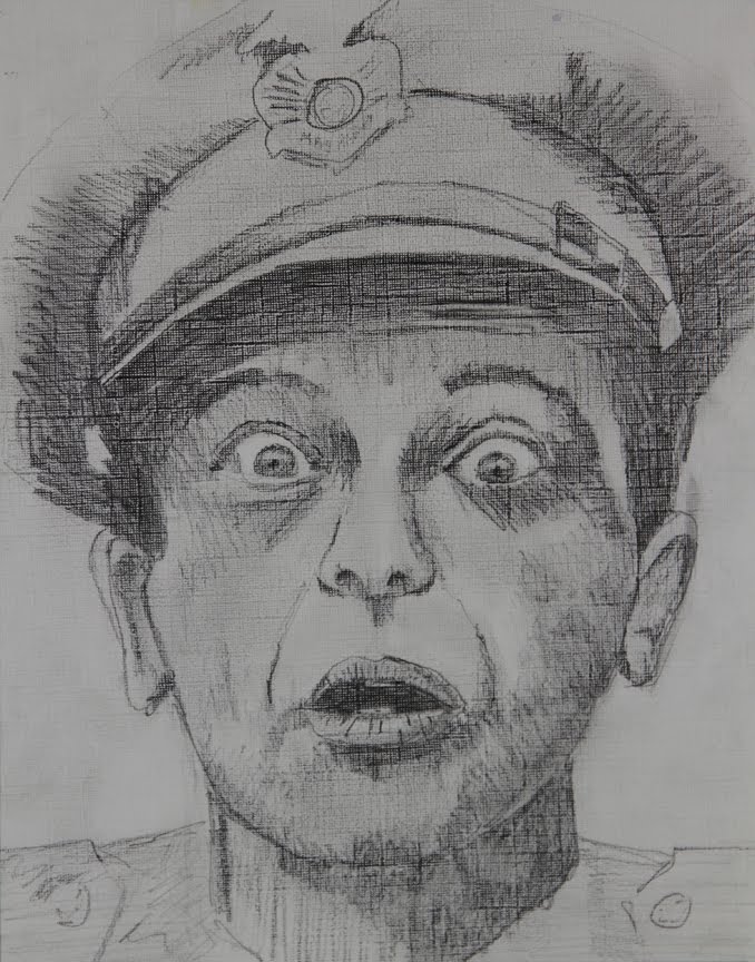 Our second portrait was of Don Knots from his days on the Andy Griffiths show. I was very surprised that some of the younger people even knew him, though he also was on some more modern shows like Three's Company. Anyway, for this portrait I enjoyed the surface used which was matt board. There is a very definite texture which allows some of the white board to show through. I used a different shading style just because I didn't have the time to do my usual smoother smudging technique. I've used a cross hatching style which was much faster to do. It's a little more muscular than smudging. These two approaches to shading with graphite are very different but each is equally effective, it's all about finding which approach you enjoy more or perhaps it's best to know both so you can use the most appropriate one for the particular drawing you are doing.
 I'm posting this portrait of King Tut again because I've added a new layer of shading and I think that it has a greater depth. For artists who are beginning in their study of value (shading) it's useful to see it as a process. I did the initial layer of shading based on my first impression. A few days later when I came back to it I was able to see a greater and more subtle range of values in the shading. This drawing is the result of that process. I can continue to come back to it and add even more layers of depth. It's useful to keep in mind, however, that more and more doesn't necessarily make it a better drawing. It's all about what you want to say. For example quick, spontaneous drawings often carry more feeling and spontaneity even if they are not as 'finished'. In this class it's about discovering how you want to interpret your subjects, no one way is always right.
 Those of us who originate from eastern Canada often lament the lack of bright reds in Alberta's fall colours. There are actually quite a few red accents in the fall colours here but they are mainly in hedges, bushes and minor characters. I've become increasingly aware of them this year. This is a view from our front yard.
  This portrait of King Tut was done in graphite on watercolour paper. The texture of this paper allows a lot of light speckles to shine through creating a pleasing effect. I made a conscious effort to direct the eye of the viewer to Tut's eyes. So I have down played the darks of the head dress at the bottom and the false beard in order to direct attention to the eyes. I have also made the darks of the head dress that are above the eye, darker as they move into the picture. Again I'm trying to direct the viewer's eye.
  I've just completed collaborating with Jean Pederson on her excellent Farm Fragments Installation at the Red Deer Museum and Art Gallery. I was there for the opening on Sunday, Sept 19. The exhibition includes paintings, collages, installations and objects illustrating life on the farm going back over 100 years. I created a video that complemented Jean's vision. It was an enjoyable challenge to combine images of abandoned farms with interviews of people who grew up on these farms. The audio track also included many nature sounds that I recorded. It was a very creative project that allowed me to stretch out videographically, so to speak.
 I just got back from an incredible time at our cabin on Lake of the Woods. I had just a couple of days to do some plein air painting. This was one of the pieces I finished, a view just beside our cabin. I enjoyed the interplay of the dark rocks and reflections with the very subdued water. I also tried to paint the rocks with out resorting to my usual habit of mixing ultramarine blue and burnt sienna to make the grays that were every where in the rocks. Instead I mixed quinacridone rose and thalo green to get what I thought was a very attractive gray. This mix was further modified in places with some yellow and in other places with some blue. I was very pleased with the value range and the composition and as always plein air paintings just seem to acquire a greater feeling of spontaneity and directness.
 What I enjoyed about this studio version of a plein air sketch of the Vermillion Lakes at Banff is the richness and variety of values and colours in the dark shape of the distant trees. There was a freedom in the application of paint in this area. I also enjoy the sense of light entering from the right especially in the grassy area between the water and the darker green trees. The darks in a painting really make the lights stand out. Paintings start to find their voice when there is a full range of values.
 This is the studio version of the previous plein air study. It's tidier than the plein air study but that doesn't necessarily mean it's better. Having said that I feel that it works very well both compositionally and in terms of the colour. As a friend said, "(It) is nice and fresh."
 I took a painting trip to Banff yesterday and it was just wonderful. It took me back to my last period of intense plein air painting when I went out every morning and did a 2 hour painting and then another 2 hour painting in the afternoon. In Banff I did this painting in about 1 and a half hours in the morning. I had visited this spot and taken photos a month ago. I'd even worked out a value study but to be there plein air and to be in the moment is something special.
 This is the third in a series of large format irises. In this one I wanted a light back ground with the value contrasts in the flower itself. The original background was done in watercolour and got too dark. I used acrylic to white out the entire background and do a new one in acrylic. So this painting is a true mixed media, half watercolour and half acrylic and I'm very pleased with the painting. I think they get along well.
 Lately, I've started painting in acrylic again. I'm interested in exploring using acrylic in a watercolour style since I love the effect of paint and water but also want the ability of adding lights over darks and acrylic seems like it might fit in with this approach very nicely. I'm also being very consistent in doing preparatory work for each new painting and this is a value study of a scene of a little creek just on the edge of the Banff town site. This is the next image I want to tackle.

 I've always really liked this image of downtown Calgary from a different perspective. This began as a fairly tepid painting then was left for over a year. Inspired by the class I've just completed I did a major reworking, feeling much freer. As a result of this it is beginning to develop it's own story.